Design Thinking & Prototyping for Recycling App
This is a fictional project I did as a part of a UX/UI further education course.
Role
Year
UX/UI Designer
2023
Design Thinking & Prototyping for Recycling App
This is a fictional project I did as a part of a UX/UI further education course.
Role
Year
UX/UI Designer
2023
Design Thinking & Prototyping for Recycling App
This is a fictional project I did as a part of a UX/UI further education course.
Role
Year
UX/UI Designer
2023
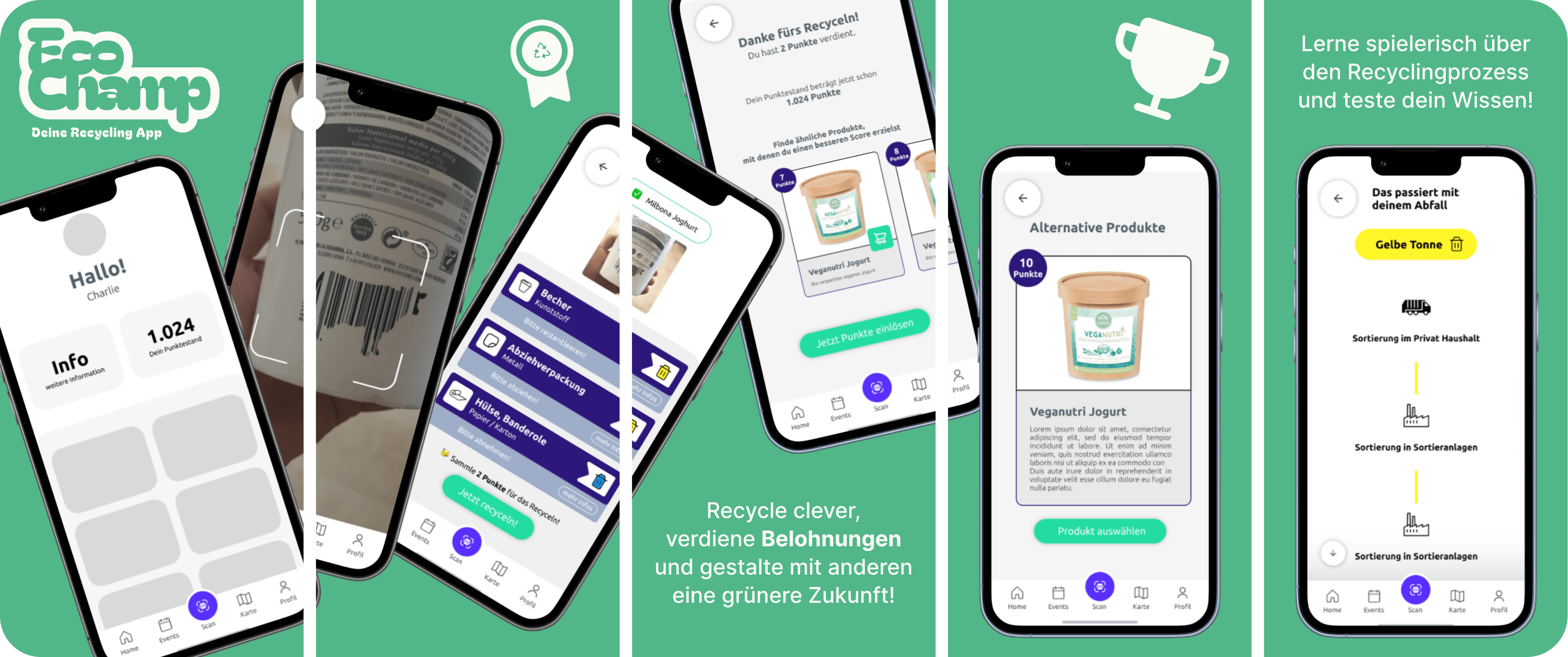


Enhancing Recycling Awareness and Engagement through a Sustainable Recycling App
In the realm of User Experience (UX) and User Interface (UI) design, the project aimed to tackle the challenge of promoting sustainable and efficient resource utilization through an innovative digital solution. The central theme was "Sustainable & Efficient Resource Utilization," with a specific focus on recycling. This case study details the beginning of the project by explaining the design thinking process.

1. Empathize
Understanding the Problem and Objectives
In this initial phase, the project team delved into understanding the problem and setting clear objectives. Through research and exploration, the team aimed to comprehend the existing landscape of recycling apps, current recycling statistics, relevant knowledge (facts and laws), and potential target user groups.
Observational Research and Survey
To better empathize with the users and their needs, an attitudinal research approach was adopted. A survey was conducted among individuals to gather insights into their recycling habits, knowledge, and preferences. The survey findings were then analyzed using an affinity diagram to identify patterns and common sentiments.
Survey Findings
100% of respondents considered waste separation important and meaningful.
93% of respondents actively practiced waste separation in their households.
63% of respondents expressed inadequate knowledge about the recycling process that occurs after waste separation.
38% of respondents found it challenging to identify recyclable materials.
93% of respondents expressed a desire to learn more about recycling.
87% of respondents indicated they would be more motivated to recycle if provided with additional incentives, such as a payback system or discounts/coupons.
2. Define
Formulating Problem Statements and Goals
Based on the insights gathered from the empathize phase, the project team articulated clear problem statements, hypotheses, and goal statements. These statements acted as guiding principles throughout the subsequent phases of the project.
Problem Statement
Charlie, environmentally conscious and 30 years old, lives in a German city and is actively involved in waste prevention and environmental protection. She already separates waste at home, but thinks the current process of recycling could be improved. She wants a simpler and faster solution. Charlie's frustration with the lack of transparency in the existing system and the lack of incentive or value for her efforts reduces her motivation.
Goal Statement
Our goal is to support Charlie, an environmentally conscious resident of a German city aged 30, to optimize her waste prevention efforts and deepen her knowledge of waste separation and recycling. We strive to develop a transparent and user-friendly digital system that will help Charlie sort waste more efficiently while motivating her by giving her tangible added value or incentives such as rewards or paybacks. By putting Charlie's needs and desires at the center of our design, we aim to improve her experience with waste and recycling and to motivate others with her environmentally conscious behavior.
3. Ideate
Solving Problems for Target Audiences
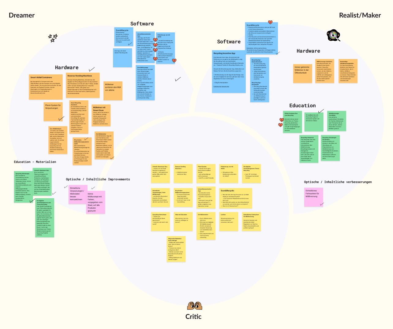
With a clear understanding of the problems and goals, the project advanced into the ideation phase. Leveraging the Walt Disney Method, the team brainstormed, evaluated, and combined ideas to devise a Minimum Viable Product (MVP) with core features. The resultant solution was named "EcoChamp."
Features: Knowledge transfer
Educational content and tips on waste separation/avoidance, recycling and environmentally friendly behavior
Players can increase knowledge while playing e.g. by scanning product and learning how to separate it and what the further process of waste looks like
Point system with rewards
Features: Navigation & Community
Critical pollution points are marked, players can overcome special challenges on site shows where you can dispose of which waste
Create and manage events, participate in events
Point system with rewards
4. Prototyping
User Stories
To ensure comprehensive coverage, user stories were formulated across five key areas: Knowledge Dissemination, Navigation & Community, Incentives, User Profile, and General. These user stories provided a foundation for the app's functionalities and interactions.
Two of the core user stories:
As a user, I would like the scan function to explain why I should recycle my waste correctly.
As a user, I want to see directly that I can collect points by separating/recycling or participating in events.
Task Flow
From the user stories, a task flow and a rudimentary information architecture were established. The task flow for the MVP encompassed crucial stages: Onboarding, Product Scanning, and Points Accumulation.
User Flow & Prototype
Based on the task flow, a detailed user flow was developed, outlining all the screens required for the MVP prototype. A user-centric approach was adopted to map out user interactions comprehensively. This facilitated the transition from wireframes to a prototype using Figma.

5. Stylescape
Every designer crafted a stylescape to explore visual design concepts and harmonize them with the existing prototypes. This stylescape serves as a foundation for progressing with the brand design and visual aspects of the User Interface.


Challenges & Conclusion
The EcoChamp project embraced challenges as opportunities, using design thinking to creatively tackle complex issues. By collaboratively using the Walt Disney Method, the team synthesized educational content, community engagement, and incentives. Clear user stories and task flows streamlined complexities, resulting in an intuitive prototype. The journey demonstrates how challenges, when met with innovation, foster user-centered solutions that inspire further development.
Enhancing Recycling Awareness and Engagement through a Sustainable Recycling App
In the realm of User Experience (UX) and User Interface (UI) design, the project aimed to tackle the challenge of promoting sustainable and efficient resource utilization through an innovative digital solution. The central theme was "Sustainable & Efficient Resource Utilization," with a specific focus on recycling. This case study details the beginning of the project by explaining the design thinking process.

1. Empathize
Understanding the Problem and Objectives
In this initial phase, the project team delved into understanding the problem and setting clear objectives. Through research and exploration, the team aimed to comprehend the existing landscape of recycling apps, current recycling statistics, relevant knowledge (facts and laws), and potential target user groups.
Observational Research and Survey
To better empathize with the users and their needs, an attitudinal research approach was adopted. A survey was conducted among individuals to gather insights into their recycling habits, knowledge, and preferences. The survey findings were then analyzed using an affinity diagram to identify patterns and common sentiments.
Survey Findings
100% of respondents considered waste separation important and meaningful.
93% of respondents actively practiced waste separation in their households.
63% of respondents expressed inadequate knowledge about the recycling process that occurs after waste separation.
38% of respondents found it challenging to identify recyclable materials.
93% of respondents expressed a desire to learn more about recycling.
87% of respondents indicated they would be more motivated to recycle if provided with additional incentives, such as a payback system or discounts/coupons.
2. Define
Formulating Problem Statements and Goals
Based on the insights gathered from the empathize phase, the project team articulated clear problem statements, hypotheses, and goal statements. These statements acted as guiding principles throughout the subsequent phases of the project.
Problem Statement
Charlie, environmentally conscious and 30 years old, lives in a German city and is actively involved in waste prevention and environmental protection. She already separates waste at home, but thinks the current process of recycling could be improved. She wants a simpler and faster solution. Charlie's frustration with the lack of transparency in the existing system and the lack of incentive or value for her efforts reduces her motivation.
Goal Statement
Our goal is to support Charlie, an environmentally conscious resident of a German city aged 30, to optimize her waste prevention efforts and deepen her knowledge of waste separation and recycling. We strive to develop a transparent and user-friendly digital system that will help Charlie sort waste more efficiently while motivating her by giving her tangible added value or incentives such as rewards or paybacks. By putting Charlie's needs and desires at the center of our design, we aim to improve her experience with waste and recycling and to motivate others with her environmentally conscious behavior.
3. Ideate
Solving Problems for Target Audiences
With a clear understanding of the problems and goals, the project advanced into the ideation phase. Leveraging the Walt Disney Method, the team brainstormed, evaluated, and combined ideas to devise a Minimum Viable Product (MVP) with core features. The resultant solution was named "EcoChamp."

Features: Knowledge transfer
Educational content and tips on waste separation/avoidance, recycling and environmentally friendly behavior
Players can increase knowledge while playing e.g. by scanning product and learning how to separate it and what the further process of waste looks like
Point system with rewards
Features: Navigation & Community
Critical pollution points are marked, players can overcome special challenges on site shows where you can dispose of which waste
Create and manage events, participate in events
Point system with rewards
4. Prototyping
User Stories
To ensure comprehensive coverage, user stories were formulated across five key areas: Knowledge Dissemination, Navigation & Community, Incentives, User Profile, and General. These user stories provided a foundation for the app's functionalities and interactions.
Two of the core user stories:
As a user, I would like the scan function to explain why I should recycle my waste correctly.
As a user, I want to see directly that I can collect points by separating/recycling or participating in events.
Task Flow
From the user stories, a task flow and a rudimentary information architecture were established. The task flow for the MVP encompassed crucial stages: Onboarding, Product Scanning, and Points Accumulation.
User Flow & Prototype
Based on the task flow, a detailed user flow was developed, outlining all the screens required for the MVP prototype. A user-centric approach was adopted to map out user interactions comprehensively. This facilitated the transition from wireframes to a prototype using Figma.

5. Stylescape
Every designer crafted a stylescape to explore visual design concepts and harmonize them with the existing prototypes. This stylescape serves as a foundation for progressing with the brand design and visual aspects of the User Interface.


Challenges & Conclusion
The EcoChamp project embraced challenges as opportunities, using design thinking to creatively tackle complex issues. By collaboratively using the Walt Disney Method, the team synthesized educational content, community engagement, and incentives. Clear user stories and task flows streamlined complexities, resulting in an intuitive prototype. The journey demonstrates how challenges, when met with innovation, foster user-centered solutions that inspire further development.
Enhancing Recycling Awareness and Engagement through a Sustainable Recycling App
In the realm of User Experience (UX) and User Interface (UI) design, the project aimed to tackle the challenge of promoting sustainable and efficient resource utilization through an innovative digital solution. The central theme was "Sustainable & Efficient Resource Utilization," with a specific focus on recycling. This case study details the beginning of the project by explaining the design thinking process.

1. Empathize
Understanding the Problem and Objectives
In this initial phase, the project team delved into understanding the problem and setting clear objectives. Through research and exploration, the team aimed to comprehend the existing landscape of recycling apps, current recycling statistics, relevant knowledge (facts and laws), and potential target user groups.
Observational Research and Survey
To better empathize with the users and their needs, an attitudinal research approach was adopted. A survey was conducted among individuals to gather insights into their recycling habits, knowledge, and preferences. The survey findings were then analyzed using an affinity diagram to identify patterns and common sentiments.
Survey Findings
100% of respondents considered waste separation important and meaningful.
93% of respondents actively practiced waste separation in their households.
63% of respondents expressed inadequate knowledge about the recycling process that occurs after waste separation.
38% of respondents found it challenging to identify recyclable materials.
93% of respondents expressed a desire to learn more about recycling.
87% of respondents indicated they would be more motivated to recycle if provided with additional incentives, such as a payback system or discounts/coupons.
2. Define
Formulating Problem Statements and Goals
Based on the insights gathered from the empathize phase, the project team articulated clear problem statements, hypotheses, and goal statements. These statements acted as guiding principles throughout the subsequent phases of the project.
Problem Statement
Charlie, environmentally conscious and 30 years old, lives in a German city and is actively involved in waste prevention and environmental protection. She already separates waste at home, but thinks the current process of recycling could be improved. She wants a simpler and faster solution. Charlie's frustration with the lack of transparency in the existing system and the lack of incentive or value for her efforts reduces her motivation.
Goal Statement
Our goal is to support Charlie, an environmentally conscious resident of a German city aged 30, to optimize her waste prevention efforts and deepen her knowledge of waste separation and recycling. We strive to develop a transparent and user-friendly digital system that will help Charlie sort waste more efficiently while motivating her by giving her tangible added value or incentives such as rewards or paybacks. By putting Charlie's needs and desires at the center of our design, we aim to improve her experience with waste and recycling and to motivate others with her environmentally conscious behavior.
3. Ideate
Solving Problems for Target Audiences
With a clear understanding of the problems and goals, the project advanced into the ideation phase. Leveraging the Walt Disney Method, the team brainstormed, evaluated, and combined ideas to devise a Minimum Viable Product (MVP) with core features. The resultant solution was named "EcoChamp."

Features: Knowledge transfer
Educational content and tips on waste separation/avoidance, recycling and environmentally friendly behavior
Players can increase knowledge while playing e.g. by scanning product and learning how to separate it and what the further process of waste looks like
Point system with rewards
Features: Navigation & Community
Critical pollution points are marked, players can overcome special challenges on site shows where you can dispose of which waste
Create and manage events, participate in events
Point system with rewards
4. Prototyping
User Stories
To ensure comprehensive coverage, user stories were formulated across five key areas: Knowledge Dissemination, Navigation & Community, Incentives, User Profile, and General. These user stories provided a foundation for the app's functionalities and interactions.
Two of the core user stories:
As a user, I would like the scan function to explain why I should recycle my waste correctly.
As a user, I want to see directly that I can collect points by separating/recycling or participating in events.
Task Flow
From the user stories, a task flow and a rudimentary information architecture were established. The task flow for the MVP encompassed crucial stages: Onboarding, Product Scanning, and Points Accumulation.
User Flow & Prototype
Based on the task flow, a detailed user flow was developed, outlining all the screens required for the MVP prototype. A user-centric approach was adopted to map out user interactions comprehensively. This facilitated the transition from wireframes to a prototype using Figma.

5. Stylescape
Every designer crafted a stylescape to explore visual design concepts and harmonize them with the existing prototypes. This stylescape serves as a foundation for progressing with the brand design and visual aspects of the User Interface.


Challenges & Conclusion
The EcoChamp project embraced challenges as opportunities, using design thinking to creatively tackle complex issues. By collaboratively using the Walt Disney Method, the team synthesized educational content, community engagement, and incentives. Clear user stories and task flows streamlined complexities, resulting in an intuitive prototype. The journey demonstrates how challenges, when met with innovation, foster user-centered solutions that inspire further development.