UX/UI and Icon design for Finance Webapp
This is a fictional project I did as a side project to test Untitled UI.
Role
Year
UX/UI Designer
2023
UX/UI and Icon design for Finance Webapp
This is a fictional project I did as a side project to test Untitled UI.
Role
Year
UX/UI Designer
2023
UX/UI and Icon design for Finance Webapp
This is a fictional project I did as a side project to test Untitled UI.
Role
Year
UX/UI Designer
2023
This is a fictional project I did as a side project to test Untitled UI, a UI kickstart kit for Figma. I imagined my customer being a finance web app company that provides financial management services to craftsmen. I created a UX/UI design for their revenue screen, including a table, tabs and filters, and a date picker. I also designed an empty state for the revenue screen and an app icon that represented the company's brand.
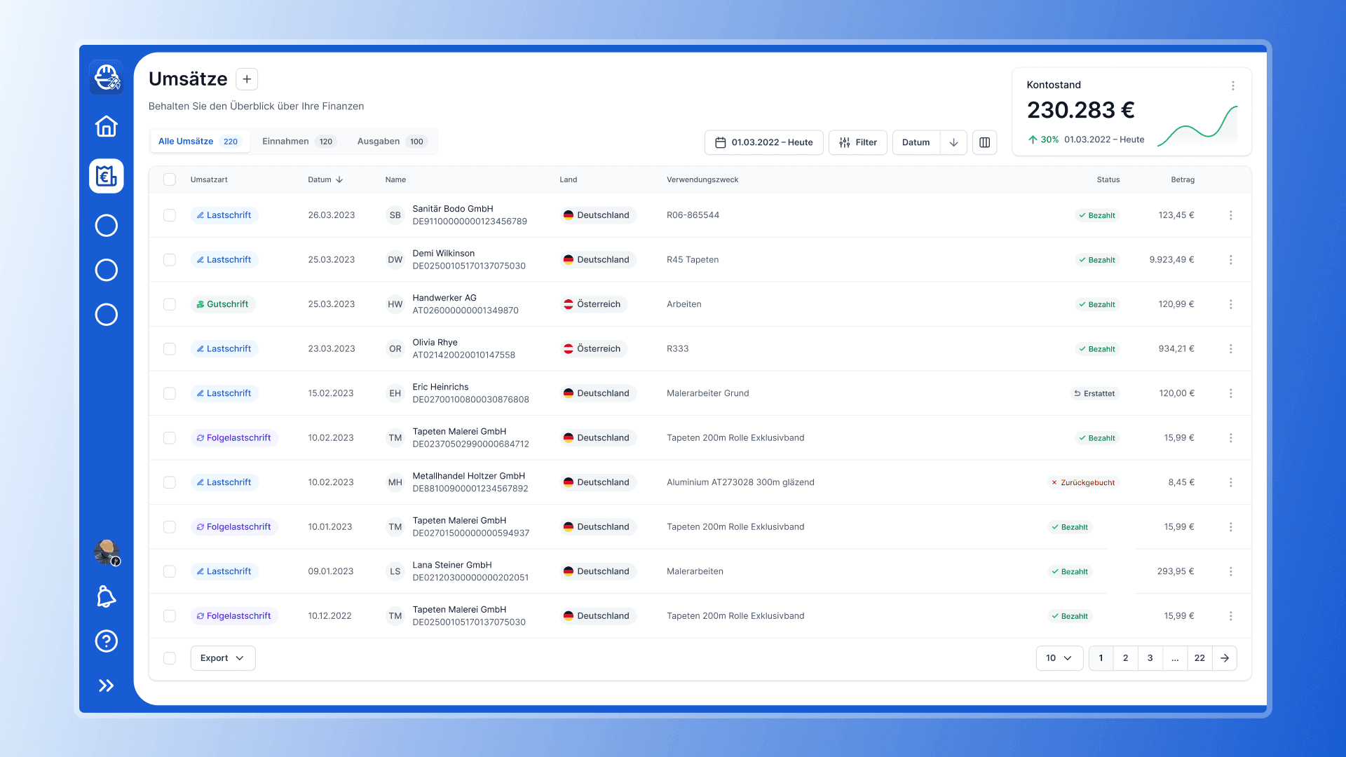
Revenue screen with a table layout and filters
Challenge
The primary challenge of the project was to create a UX/UI design that was intuitive and user-friendly, providing an easy-to-use interface for craftsmen. Especially for craftsmen, finances are an annoying issue with which they want to spend as little time as possible. The client required a revenue screen that included a table, tabs, and filters, enabling users to manage their finances quickly and easily. The design needed to be visually appealing and functional.
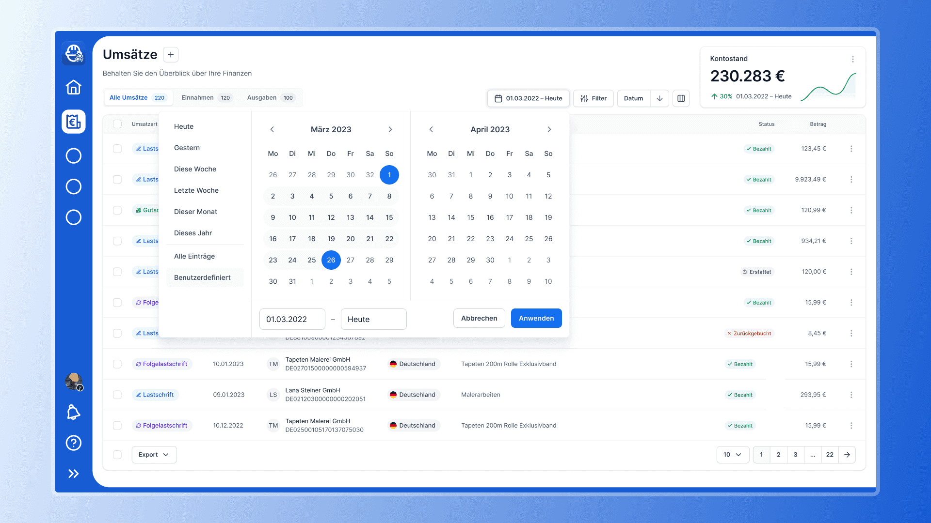
Pick a date range to filter your revenue
Solution
I began by conducting research into the target audience and competitors. I wanted to understand the pain points and design a user-centric solution. Based on the research, I designed a revenue screen that included a table with filters, tabs, and a date picker, allowing users to manage their finances easily.
I also designed an empty state for the revenue screen, providing users with a clear message when they had no data to display. The empty state was designed to be visually appealing with a friendly illustration and provide users with a clear call to action to start adding data to their revenue screen.
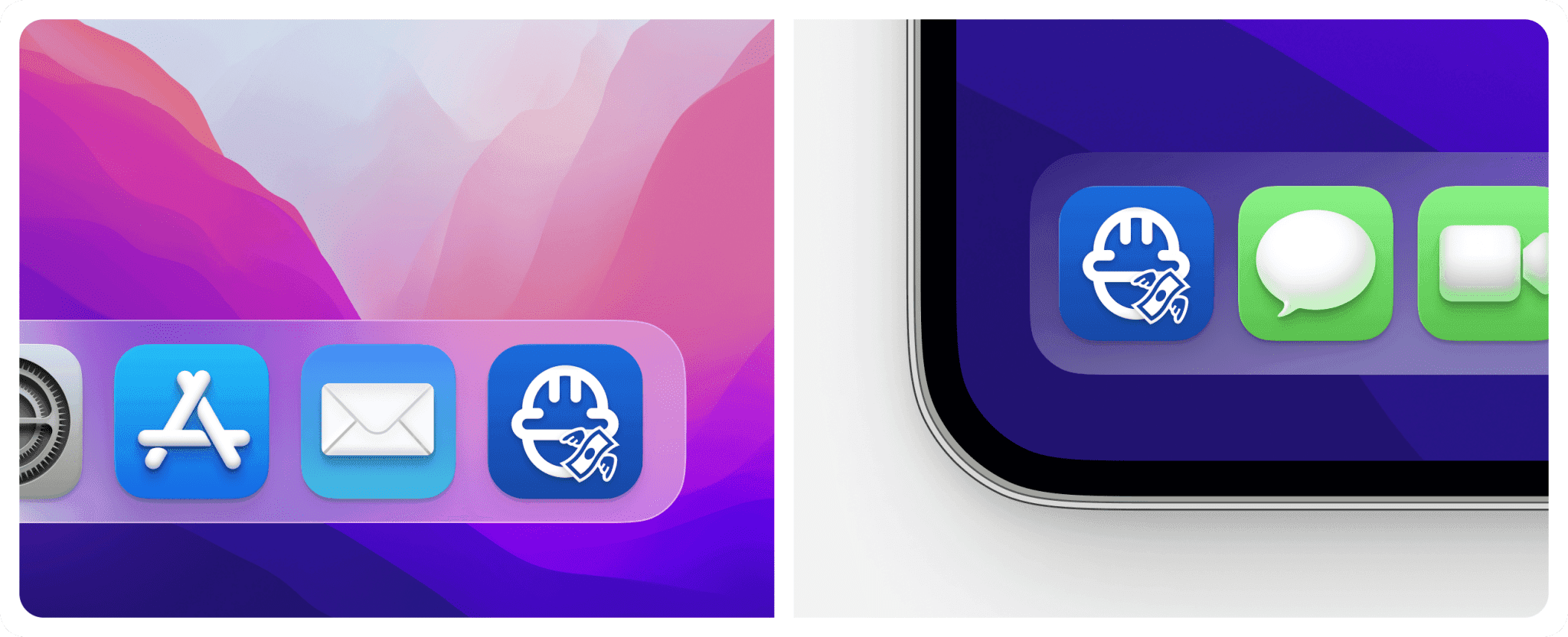
To represent the company's brand, I designed an app icon that included an outline of a craftsman head with a helmet and a money bill. The app icon was designed to be modern and friendly and represent the company's values of financial management and professionalism.
This is also the reason why i chose blue as the base color. From a psychological point of view, blue stands for seriousness and professionalism.
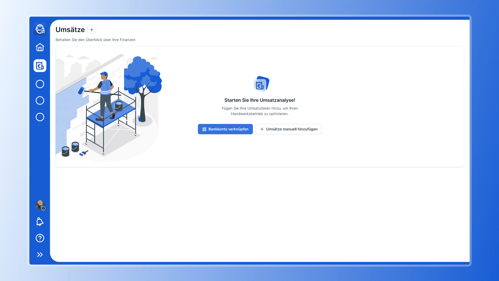
Empty State of the revenue screen with a friendly illustration and call to action
Results
The UX/UI design for the imaginative finance web app provided a better user experience for craftsmen, enabling them to manage their finances easily and efficiently. The revenue screen included a table with filters, tabs, and a date picker, providing users with a clear overview of their financial management. The empty state provided users with a clear message when they had no data to display, encouraging them to start adding data to their revenue screen.
The app icon represents the company's values of financial management and professionalism, providing a clear brand message and recognition value to users.
This is a fictional project I did as a side project to test Untitled UI, a UI kickstart kit for Figma. I imagined my customer being a finance web app company that provides financial management services to craftsmen. I created a UX/UI design for their revenue screen, including a table, tabs and filters, and a date picker. I also designed an empty state for the revenue screen and an app icon that represented the company's brand.
Revenue screen with a table layout and filters
Challenge
The primary challenge of the project was to create a UX/UI design that was intuitive and user-friendly, providing an easy-to-use interface for craftsmen. Especially for craftsmen, finances are an annoying issue with which they want to spend as little time as possible. The client required a revenue screen that included a table, tabs, and filters, enabling users to manage their finances quickly and easily. The design needed to be visually appealing and functional.
Pick a date range to filter your revenue
Solution
I began by conducting research into the target audience and competitors. I wanted to understand the pain points and design a user-centric solution. Based on the research, I designed a revenue screen that included a table with filters, tabs, and a date picker, allowing users to manage their finances easily.
I also designed an empty state for the revenue screen, providing users with a clear message when they had no data to display. The empty state was designed to be visually appealing with a friendly illustration and provide users with a clear call to action to start adding data to their revenue screen.
To represent the company's brand, I designed an app icon that included an outline of a craftsman head with a helmet and a money bill. The app icon was designed to be modern and friendly and represent the company's values of financial management and professionalism.
This is also the reason why i chose blue as the base color. From a psychological point of view, blue stands for seriousness and professionalism.
Empty State of the revenue screen with a friendly illustration and call to action
Results
The UX/UI design for the imaginative finance web app provided a better user experience for craftsmen, enabling them to manage their finances easily and efficiently. The revenue screen included a table with filters, tabs, and a date picker, providing users with a clear overview of their financial management. The empty state provided users with a clear message when they had no data to display, encouraging them to start adding data to their revenue screen.
The app icon represents the company's values of financial management and professionalism, providing a clear brand message and recognition value to users.
