UX/UI Redesign at easybill
Redesigned User Interfaces of easybill's webapp and a Design System to manage components and their variants.
Role
Year
UX/UI Designer
2023
UX/UI Redesign at easybill
Redesigned User Interfaces of easybill's webapp and a Design System to manage components and their variants.
Role
Year
UX/UI Designer
2023
UX/UI Redesign at easybill
Redesigned User Interfaces of easybill's webapp and a Design System to manage components and their variants.
Role
Year
UX/UI Designer
2023
A Redesign of easybill's user interfaces in their webapp and a design system to manage components and their variants.
Background
easybill is a cloud-based invoicing software that allows businesses to automate their billing process and create professional invoices. The company was founded in 2007 and has grown rapidly over the years, attracting a diverse range of customers from freelancers to small businesses to large enterprises. With an increasing number of users, easybill realized that its current user interface (UI) was outdated and no longer meeting the needs of its customers. They decided to embark on a redesign project to improve the user experience (UX) and make it easier for customers to use their software.
Goals
The primary goals of the redesign project were to create a modern and intuitive UI for easybill's web application that would increase customer satisfaction, improve usability, and reduce the number of errors made by users. The company also wanted to establish a design system to manage their components and their variants, ensuring consistency across the platform.
Approach
First, I created an Information Architecture to get an overview of all pages and links. Then, in consultation with the stakeholders, I restructured it to correct previously misplaced pages and make the overall software clearer and easier to understand.
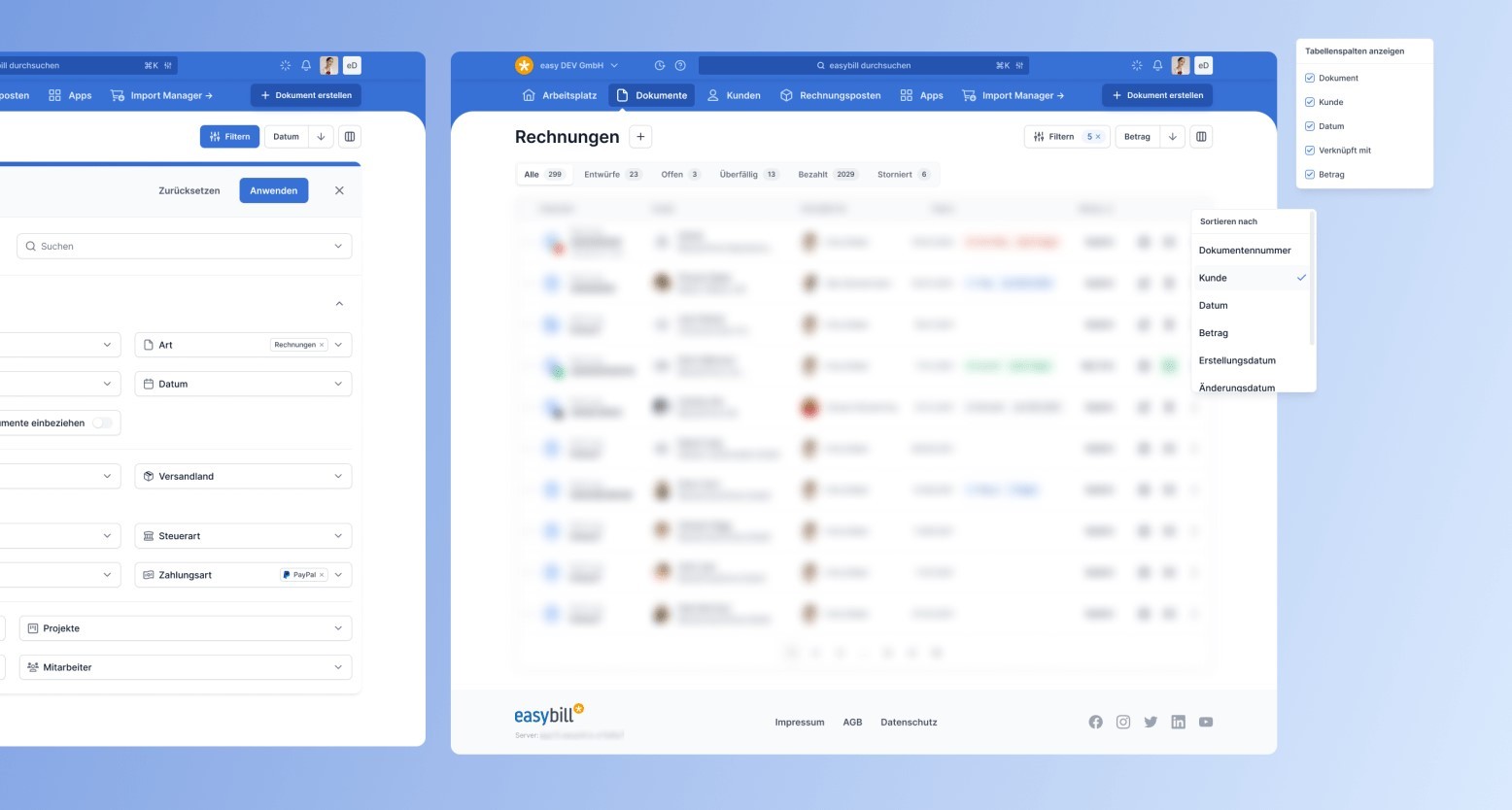
The navigation and the fact that it's not mobile friendly turned out to be the two biggest pain points. I designed and prototyped several different navigation layouts in Figma to pitch to the stakeholders. Because the users are used to a horizontal navigation, we agreed that it's best to stick to the already proven concept, but improving it by clearly structured and rearranged submenus.
In the same move, I also established a design system to manage the components used in the new UI and their variants. This system ensured consistency in the design and helped reduce the time and effort required for future updates and iterations.
The new UI was designed with a focus on simplicity, ease of use, and accessibility. It features a clean and modern design, with a user-friendly navigation system that allows users to quickly and easily find the features they need. The design system included guidelines for typography, color palette, and component behavior, providing a cohesive look and feel across the platform.
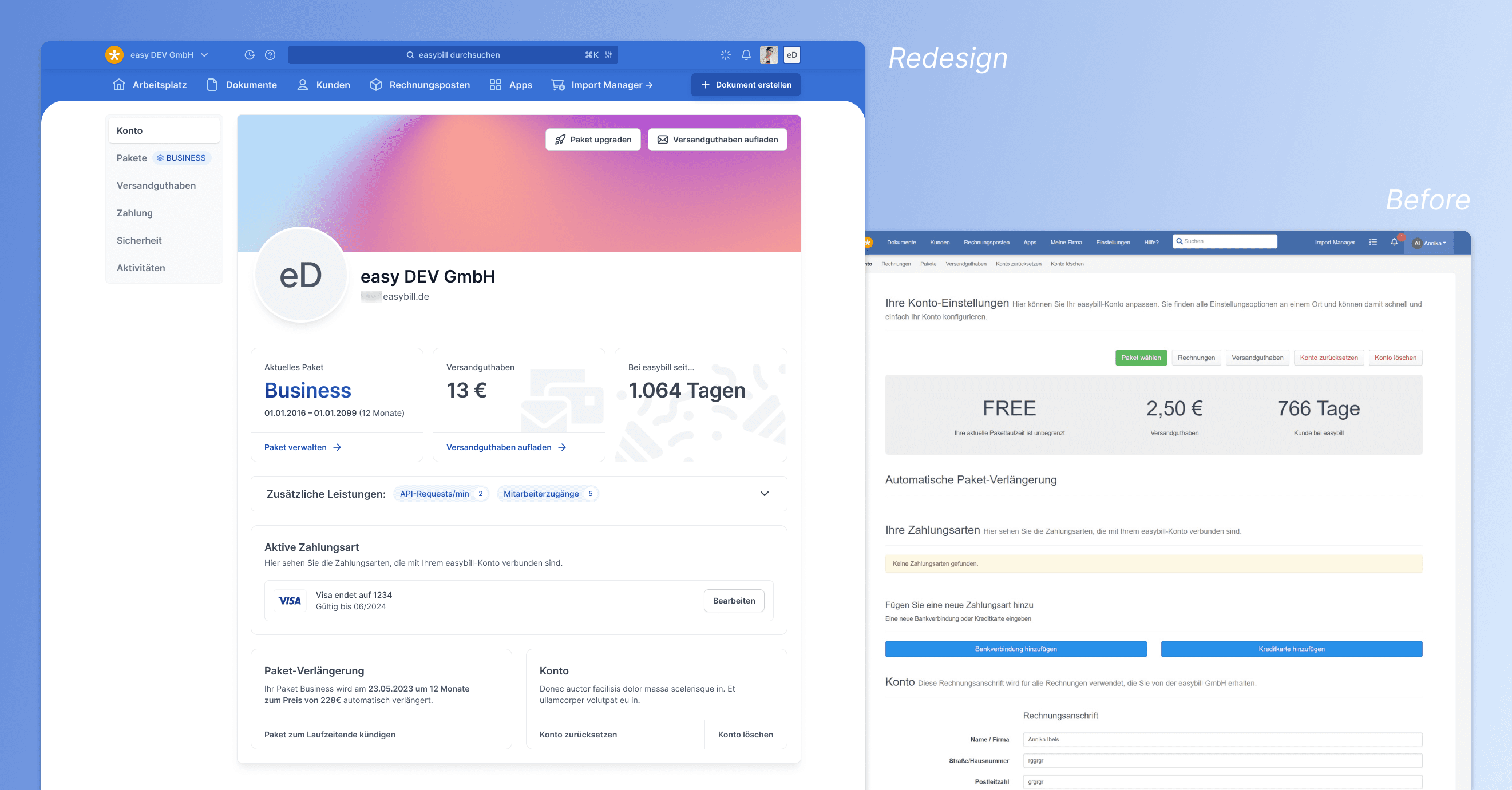
Redesign of Account page
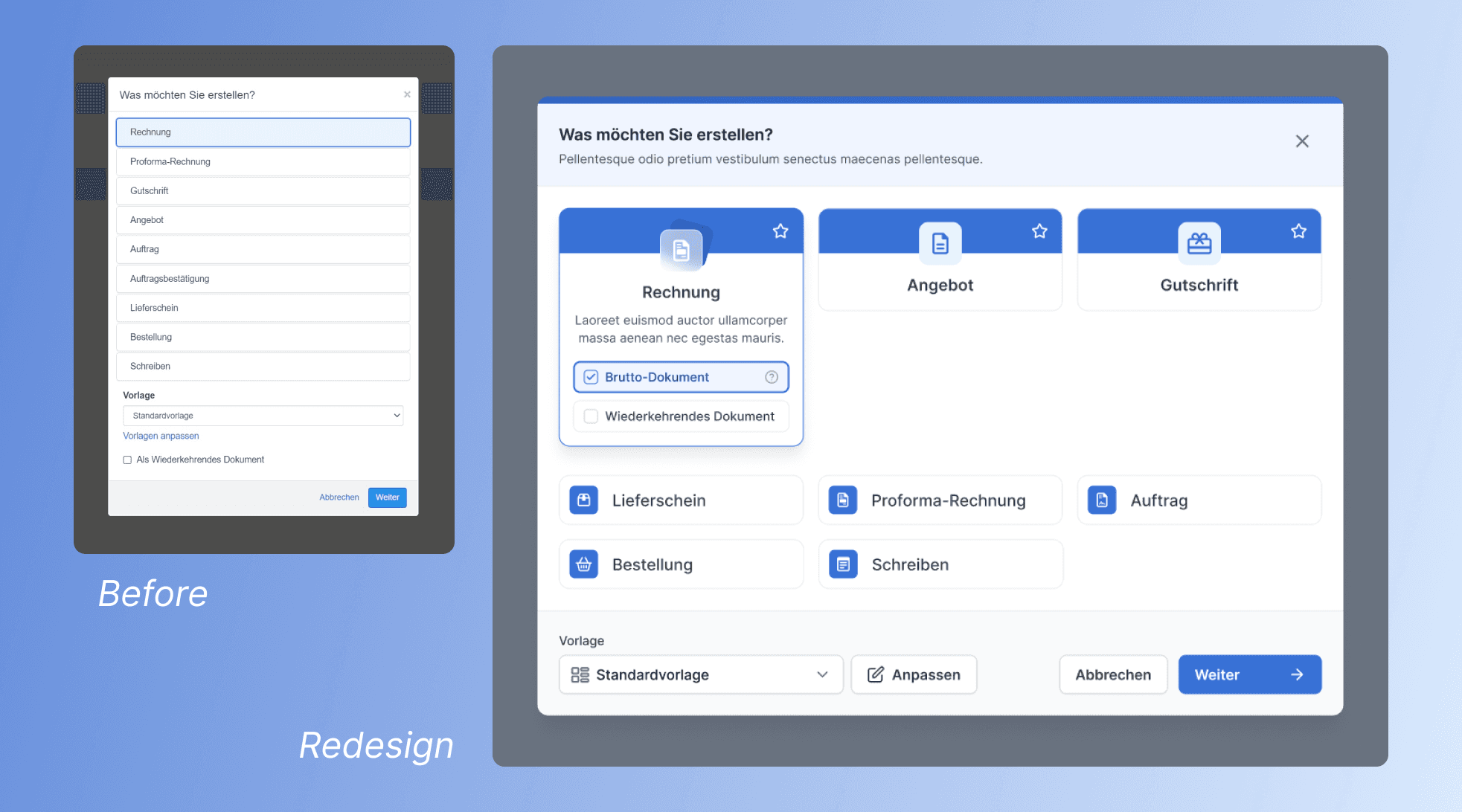
Redesign of "Create Document" Modal
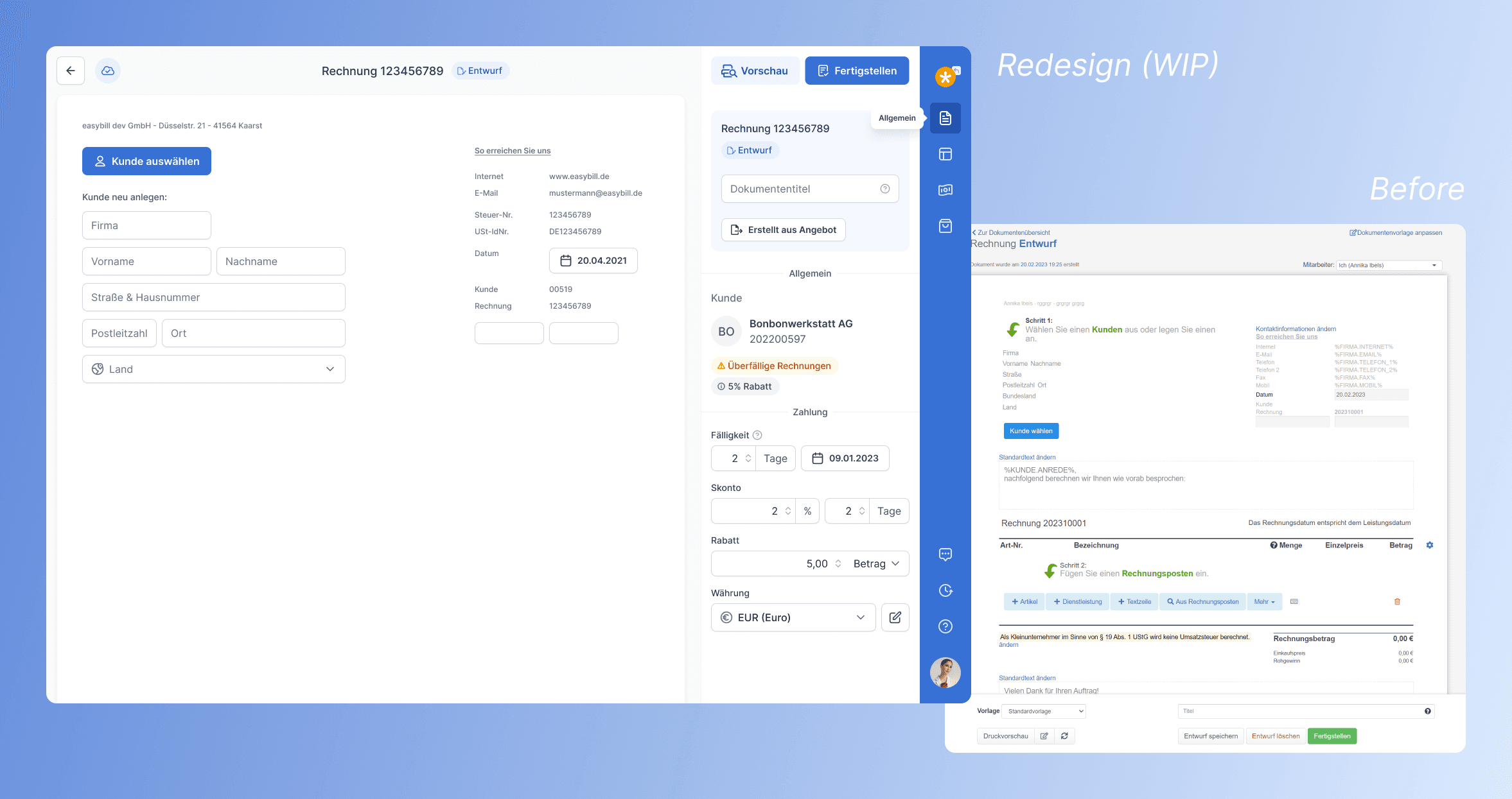
Redesign of Document Editor with a focus on usability & accessibility
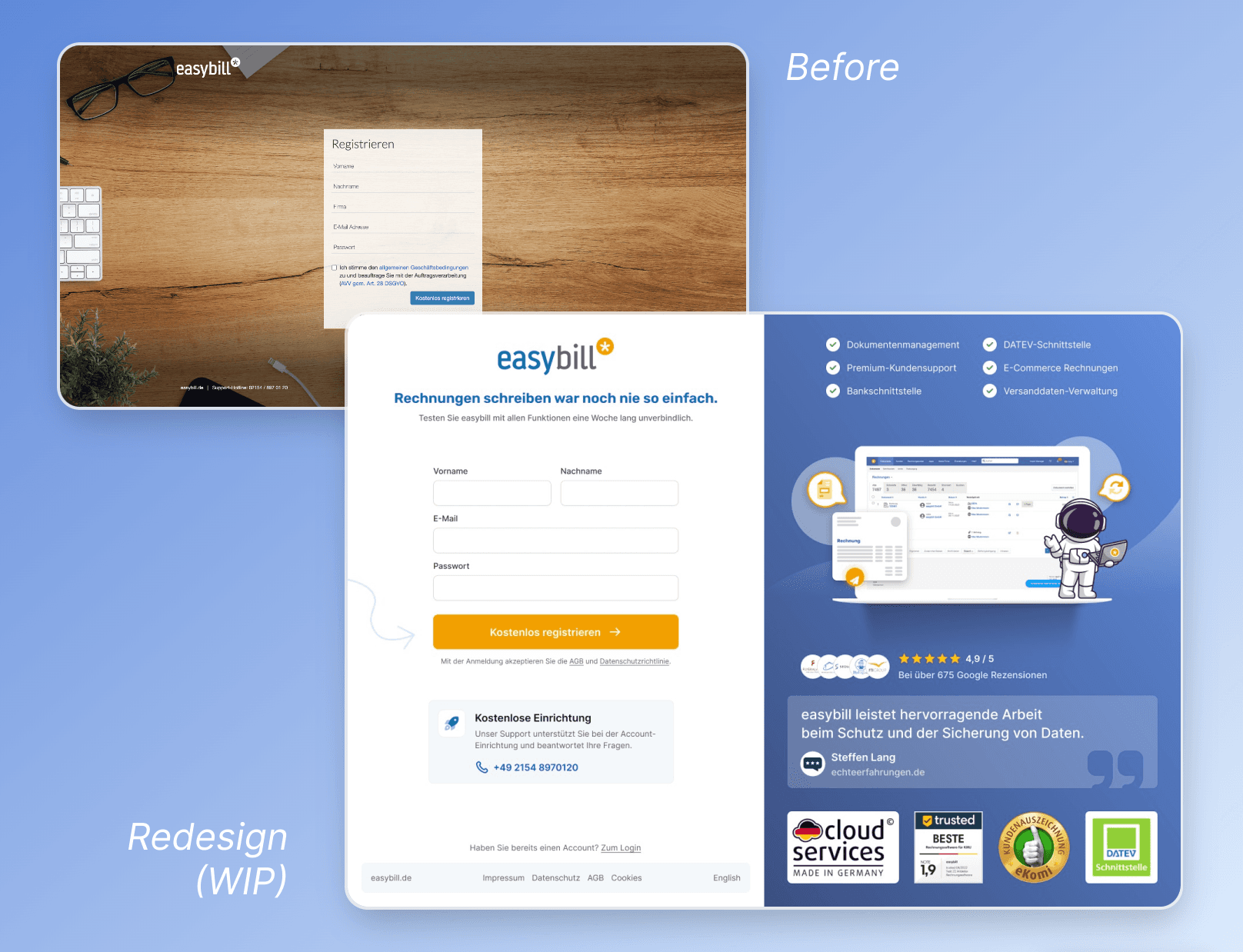
Before & After: Redesign Sign Up page
The redesign of the sign-up page is intended to increase conversion.
easybill's USP, customer support with free onboarding, is placed prominently to increase conversion. Trust seals, customer reviews and a customer quote serve as reassurance and credibility.
A Redesign of easybill's user interfaces in their webapp and a design system to manage components and their variants.
Background
easybill is a cloud-based invoicing software that allows businesses to automate their billing process and create professional invoices. The company was founded in 2007 and has grown rapidly over the years, attracting a diverse range of customers from freelancers to small businesses to large enterprises. With an increasing number of users, easybill realized that its current user interface (UI) was outdated and no longer meeting the needs of its customers. They decided to embark on a redesign project to improve the user experience (UX) and make it easier for customers to use their software.
Goals
The primary goals of the redesign project were to create a modern and intuitive UI for easybill's web application that would increase customer satisfaction, improve usability, and reduce the number of errors made by users. The company also wanted to establish a design system to manage their components and their variants, ensuring consistency across the platform.
Approach
First, I created an Information Architecture to get an overview of all pages and links. Then, in consultation with the stakeholders, I restructured it to correct previously misplaced pages and make the overall software clearer and easier to understand.
The navigation and the fact that it's not mobile friendly turned out to be the two biggest pain points. I designed and prototyped several different navigation layouts in Figma to pitch to the stakeholders. Because the users are used to a horizontal navigation, we agreed that it's best to stick to the already proven concept, but improving it by clearly structured and rearranged submenus.
In the same move, I also established a design system to manage the components used in the new UI and their variants. This system ensured consistency in the design and helped reduce the time and effort required for future updates and iterations.
The new UI was designed with a focus on simplicity, ease of use, and accessibility. It features a clean and modern design, with a user-friendly navigation system that allows users to quickly and easily find the features they need. The design system included guidelines for typography, color palette, and component behavior, providing a cohesive look and feel across the platform.
Redesign of Account page
Redesign of "Create Document" Modal
Redesign of Document Editor with a focus on usability & accessibility
Before & After: Redesign Sign Up page
The redesign of the sign-up page is intended to increase conversion.
easybill's USP, customer support with free onboarding, is placed prominently to increase conversion. Trust seals, customer reviews and a customer quote serve as reassurance and credibility.
