Website Redesign at easybill
A new website with a modern look for easybill. Built with Wordpress CMS and a customized theme. It now includes the news blog and is available in English.
Role
Year
UX/UI Designer
2022
Website Redesign at easybill
A new website with a modern look for easybill. Built with Wordpress CMS and a customized theme. It now includes the news blog and is available in English.
Role
Year
UX/UI Designer
2022
Website Redesign at easybill
A new website with a modern look for easybill. Built with Wordpress CMS and a customized theme. It now includes the news blog and is available in English.
Role
Year
UX/UI Designer
2022
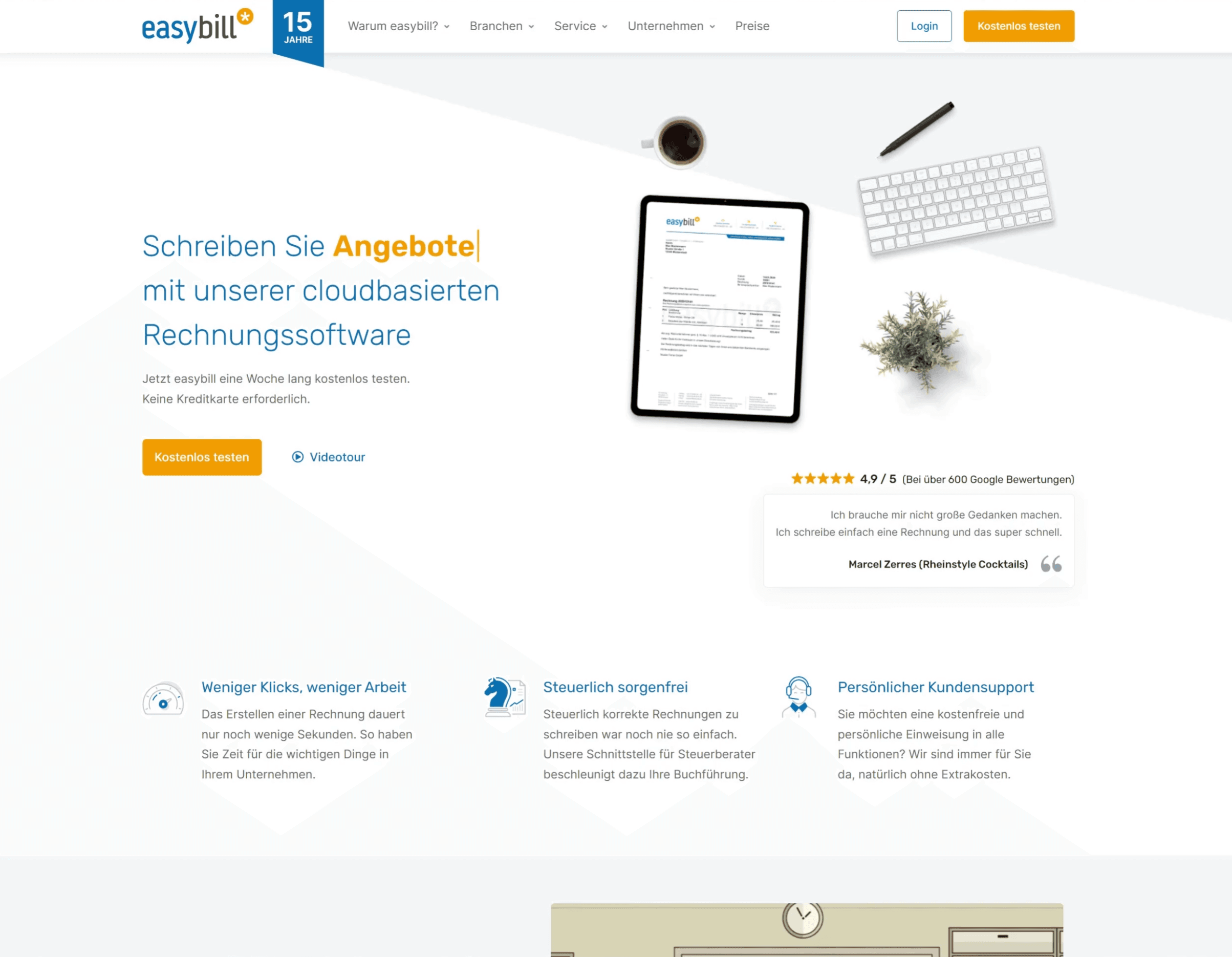


Redesign and Realization of easybill’s Website
A new website with a modern look for easybill. Built with Wordpress CMS and a highly customised theme. It now also includes the news blog and is available in English.
Background
easybill is a cloud-based invoicing software that allows businesses to automate their billing process and create professional invoices. The company was founded in 2007 and has grown rapidly over the years, attracting a diverse range of customers from freelancers to small businesses to large enterprises. Despite having a robust product, their website was outdated and not optimized for user experience – it wasn't mobile friendly and had accessibility issues. As a result, easybill approached me to help them redesign and realize their website to increase customer engagement and conversions.
Challenge
The primary challenge of the project was to create a website that reflected the innovative and digital nature of easybill's product while being easy to navigate for potential customers. The existing website was cluttered, lacked clear navigation, and failed to communicate the value proposition of the product.
Solution
I started by conducting an audit of easybill's existing website, user behavior, and competitor analysis. Based on the findings, I came up with a design strategy that focused on improving the user experience and highlighting the product's unique selling points.
The new design included a clean and modern interface with a simplified navigation structure, allowing users to find what they need easily in mega menus. I also integrated visual aids and animations to help communicate the product's features more effectively. Additionally, customer testimonials and case studies are placed prominently on the website to help build trust and showcase easybill's success. The above the fold area on the front page features a customer quote and the Google rating to boost credibility.
To further improve the user experience, I ensured a responsive design, allowing the website to be accessed from every device, no matter if displayed on an iPhone or 4K monitor, seamlessly. I also created landing pages with personalized content for different types of users, such as freelancers or small businesses, to help increase conversions. The landing pages are also getting advertised as Google Ads.
Results
The redesign and realization of the website had a positive impact on easybill's business. The simplified navigation and modern interface led to an increase in website traffic and average engagement time.
Furthermore, the personalized landing pages resulted in an increase in engagement, and the integration of visual aids and CTA buttons improved the conversion rate. The customer feedback on the new design was also overwhelmingly positive, with many praising the website's ease of use and modern aesthetic.
Conclusion
The redesign and realization of easybill's website allowed them to communicate their value proposition more effectively and improve the user experience for potential customers. The result was a significant increase in traffic, engagement and conversions, demonstrating the importance of investing in user-centered design to improve business outcomes.
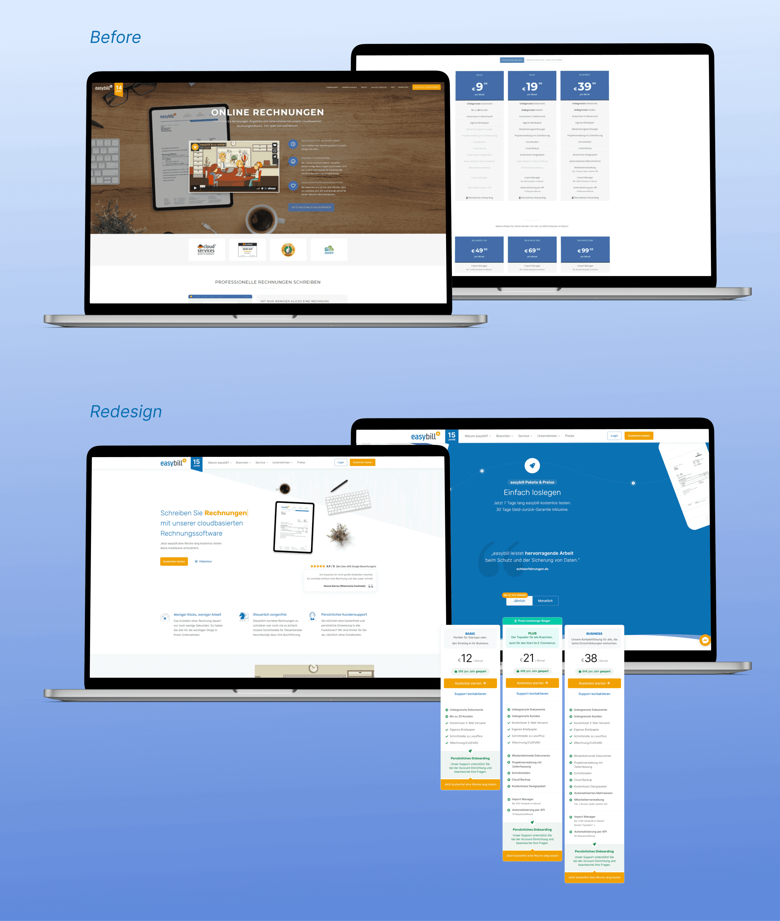
Before and After: Redesign of easybill's corporate website
💡 Crucial elements, such as the pricing table were A/B tested with a whole new look and focus on the middle pricing plan to subconsciously direct users. This resulted in more interest in the higher cost plan according to analysis heatmaps. Setting the yearly plan as initial selection and summarizing the savings in booking a yearly plan helped in getting more users interesting in a yearly plan. By highlighting easybill's USP – their support – users get a reassuring feeling before clicking on the primary action: registering and starting a free trial.
Redesign and Realization of easybill’s Website
A new website with a modern look for easybill. Built with Wordpress CMS and a highly customised theme. It now also includes the news blog and is available in English.
Background
easybill is a cloud-based invoicing software that allows businesses to automate their billing process and create professional invoices. The company was founded in 2007 and has grown rapidly over the years, attracting a diverse range of customers from freelancers to small businesses to large enterprises. Despite having a robust product, their website was outdated and not optimized for user experience – it wasn't mobile friendly and had accessibility issues. As a result, easybill approached me to help them redesign and realize their website to increase customer engagement and conversions.
Challenge
The primary challenge of the project was to create a website that reflected the innovative and digital nature of easybill's product while being easy to navigate for potential customers. The existing website was cluttered, lacked clear navigation, and failed to communicate the value proposition of the product.
Solution
I started by conducting an audit of easybill's existing website, user behavior, and competitor analysis. Based on the findings, I came up with a design strategy that focused on improving the user experience and highlighting the product's unique selling points.
The new design included a clean and modern interface with a simplified navigation structure, allowing users to find what they need easily in mega menus. I also integrated visual aids and animations to help communicate the product's features more effectively. Additionally, customer testimonials and case studies are placed prominently on the website to help build trust and showcase easybill's success. The above the fold area on the front page features a customer quote and the Google rating to boost credibility.
To further improve the user experience, I ensured a responsive design, allowing the website to be accessed from every device, no matter if displayed on an iPhone or 4K monitor, seamlessly. I also created landing pages with personalized content for different types of users, such as freelancers or small businesses, to help increase conversions. The landing pages are also getting advertised as Google Ads.
Results
The redesign and realization of the website had a positive impact on easybill's business. The simplified navigation and modern interface led to an increase in website traffic and average engagement time.
Furthermore, the personalized landing pages resulted in an increase in engagement, and the integration of visual aids and CTA buttons improved the conversion rate. The customer feedback on the new design was also overwhelmingly positive, with many praising the website's ease of use and modern aesthetic.
Conclusion
The redesign and realization of easybill's website allowed them to communicate their value proposition more effectively and improve the user experience for potential customers. The result was a significant increase in traffic, engagement and conversions, demonstrating the importance of investing in user-centered design to improve business outcomes.

Before and After: Redesign of easybill's corporate website
💡 Crucial elements, such as the pricing table were A/B tested with a whole new look and focus on the middle pricing plan to subconsciously direct users. This resulted in more interest in the higher cost plan according to analysis heatmaps. Setting the yearly plan as initial selection and summarizing the savings in booking a yearly plan helped in getting more users interesting in a yearly plan. By highlighting easybill's USP – their support – users get a reassuring feeling before clicking on the primary action: registering and starting a free trial.
Redesign and Realization of easybill’s Website
A new website with a modern look for easybill. Built with Wordpress CMS and a highly customised theme. It now also includes the news blog and is available in English.
Background
easybill is a cloud-based invoicing software that allows businesses to automate their billing process and create professional invoices. The company was founded in 2007 and has grown rapidly over the years, attracting a diverse range of customers from freelancers to small businesses to large enterprises. Despite having a robust product, their website was outdated and not optimized for user experience – it wasn't mobile friendly and had accessibility issues. As a result, easybill approached me to help them redesign and realize their website to increase customer engagement and conversions.
Challenge
The primary challenge of the project was to create a website that reflected the innovative and digital nature of easybill's product while being easy to navigate for potential customers. The existing website was cluttered, lacked clear navigation, and failed to communicate the value proposition of the product.
Solution
I started by conducting an audit of easybill's existing website, user behavior, and competitor analysis. Based on the findings, I came up with a design strategy that focused on improving the user experience and highlighting the product's unique selling points.
The new design included a clean and modern interface with a simplified navigation structure, allowing users to find what they need easily in mega menus. I also integrated visual aids and animations to help communicate the product's features more effectively. Additionally, customer testimonials and case studies are placed prominently on the website to help build trust and showcase easybill's success. The above the fold area on the front page features a customer quote and the Google rating to boost credibility.
To further improve the user experience, I ensured a responsive design, allowing the website to be accessed from every device, no matter if displayed on an iPhone or 4K monitor, seamlessly. I also created landing pages with personalized content for different types of users, such as freelancers or small businesses, to help increase conversions. The landing pages are also getting advertised as Google Ads.
Results
The redesign and realization of the website had a positive impact on easybill's business. The simplified navigation and modern interface led to an increase in website traffic and average engagement time.
Furthermore, the personalized landing pages resulted in an increase in engagement, and the integration of visual aids and CTA buttons improved the conversion rate. The customer feedback on the new design was also overwhelmingly positive, with many praising the website's ease of use and modern aesthetic.
Conclusion
The redesign and realization of easybill's website allowed them to communicate their value proposition more effectively and improve the user experience for potential customers. The result was a significant increase in traffic, engagement and conversions, demonstrating the importance of investing in user-centered design to improve business outcomes.

Before and After: Redesign of easybill's corporate website
💡 Crucial elements, such as the pricing table were A/B tested with a whole new look and focus on the middle pricing plan to subconsciously direct users. This resulted in more interest in the higher cost plan according to analysis heatmaps. Setting the yearly plan as initial selection and summarizing the savings in booking a yearly plan helped in getting more users interesting in a yearly plan. By highlighting easybill's USP – their support – users get a reassuring feeling before clicking on the primary action: registering and starting a free trial.